Janae Koch LLC
SERVICE
Full Brand Identity
Janae Koch, Pediatric Holistic Wellness
Janae Koch is dedicated to transforming pediatric healthcare through a holistic approach that empowers parents and nurtures the well-being of children. As a leading specialist in pediatric functional medicine, Janae offers personalized concierge telemedicine services, addressing each child's unique health needs. With a strong focus on gut health and nutrition, she integrates modern medical knowledge with natural, holistic practices.
Passionate about educating parents, Janae leads workshops and consultations to help families embrace wellness through balanced living. Her compassionate care and innovative methods create a nurturing environment where young patients can thrive.
With a commitment to purity, wellness, and a holistic lifestyle, Janae Koch is here to guide families toward a brighter, healthier future.
"I believe true health begins with understanding the whole child—mind, body, and spirit. By combining natural practices with personalized care, we can nurture vibrant, thriving children and empower families to live healthier, more balanced lives." — Janae Koch

Brand Identity for Janae Koch LLC
Janae Koch LLC has been established as a trusted leader in pediatric holistic health and wellness, specializing in concierge telemedicine and functional medicine. With a focus on root-cause solutions for issues such as gut health, eczema, and mold illness, the brand provides personalized care for families, particularly mothers seeking holistic alternatives to conventional medical treatments.
Brand Strategy
The brand strategy of Janae Koch LLC is built around creating a compassionate, approachable, and expert-driven presence that bridges the gap between conventional and holistic medicine. Our goal is to position Janae Koch LLC as the go-to resource for families who prioritize holistic health for their children but seek guidance from a professional with both medical and personal experience.
What We Seek to Communicate
At the heart of Janae Koch LLC’s communication is a sense of hope, healing, and trust. The brand's tone is warm, compassionate, and professional, ensuring that every interaction leaves clients feeling understood and empowered. We want to reassure families that they are in the hands of a highly trained expert who also shares their personal struggles and triumphs in managing pediatric health issues.
Compassion and Understanding: Janae Koch LLC provides a safe space where moms feel listened to and understood, knowing they are working with a provider who truly “gets it.”
Professional Expertise: As a Physician Assistant with both conventional and functional training, Janae Koch brings credibility and trust, differentiating the brand from other holistic health offerings.
Holistic Solutions: We offer practical, tailored solutions that treat the root cause of health concerns, empowering families to heal naturally and holistically.
Target Audience
Our target audience includes moms with young children who are navigating a more holistic lifestyle and are seeking expert pediatric care that extends beyond conventional treatments. These mothers often feel frustrated with mainstream medical approaches and want to explore natural solutions that align with their values of health, wellness, and family care. They are proactive, highly engaged in their children's health, and value providers who listen, support, and provide actionable guidance.
Demographics
Age: 28-45
Gender: Female
Family Focused: Primarily mothers with young children
Location: Primarily remote, concierge telemedicine practice
How This Brand Speaks for Them
Janae Koch LLC speaks directly to moms who are looking for a health provider that combines expertise with empathy. These are parents who may have felt dismissed by conventional medicine and want to pursue holistic, natural healing for their children’s chronic conditions. The brand addresses their needs in several key ways:
Empathy and Shared Experience: The brand positions Janae not only as a professional but also as a mother who has personally faced gut health, eczema, and other pediatric challenges. This builds a personal connection and makes moms feel supported.
Approachability and Trust: Janae Koch LLC communicates in a warm, approachable tone, using simple, clear language without overwhelming medical jargon. This tone builds trust and reduces the anxiety many parents feel when managing their child’s health.
Credibility: The brand emphasizes Janae’s unique qualifications as a PA with holistic training, setting it apart from the often unqualified advice found in online holistic spaces. This reassures mothers that the advice and treatment plans are grounded in medical expertise.
Visual Identity and Messaging
Visual Elements
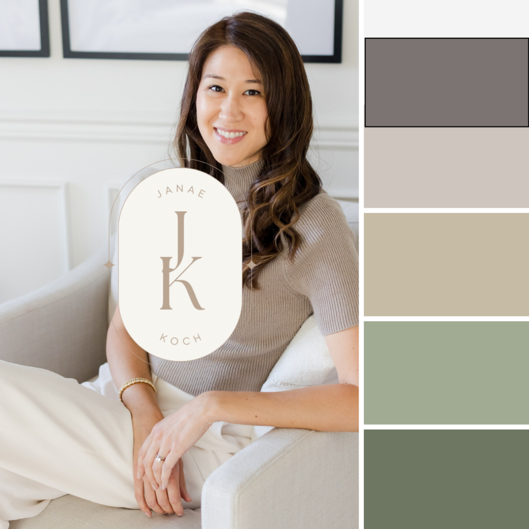
The brand’s visual identity is soft, calming, and nurturing. A palette of whites, grey, various shades of greens, and soft tan reinforces a sense of purity, natural healing, calm, warmth, while pops of purple adds a touch of creativity and wisdom. The overall aesthetic is clean and minimal, avoiding overwhelming visuals or harsh colors, which can feel clinical or impersonal.
White: Represents purity, simplicity, and openness.
Grey: Balance, sophistication, timeless class
Green: Symbolizes health, healing, and natural growth.
Tan: Conveys calmness, warmth and a sense of safety.
Purple Accent: A small pop of purple adds a hint of creativity and insight.
Messaging
The messaging throughout the brand is always patient-centered and caring. It communicates that Janae Koch LLC is not just offering treatments, but a partnership in helping families thrive through personalized and holistic care.
Tagline: “Pediatric Holistic Health & Wellness” – straightforward yet encompassing of the full breadth of services and care offered.
Core Messaging: “We offer hope, healing, and guidance to families who seek a holistic approach to pediatric health. Through compassionate care and expert guidance, we help your children thrive.”
How the Brand Speaks to the Target Audience
Moms seeking holistic health solutions are often overwhelmed by conflicting advice and information. Janae Koch LLC offers them clarity and reassurance by presenting a brand that is both professional and approachable. The calm, cohesive design of the website and social media, paired with warm and nurturing messaging, provides them with a sense of peace and confidence in the care they will receive.
Calming visuals reduce stress and communicate a sense of trust.
Expert advice reassures mothers that they are making the right choice for their child’s health.
Empathetic language speaks directly to moms, acknowledging their fears and providing solutions that work for their families.
Conclusion
Janae Koch LLC’s brand identity is built to resonate with families seeking a holistic approach to pediatric care that is both professional and deeply personal. Through a combination of compassionate communication, expert care, and a visually calming presence, the brand speaks to the needs of moms who want to feel empowered, understood, and confident in their journey toward health and wellness for their children.
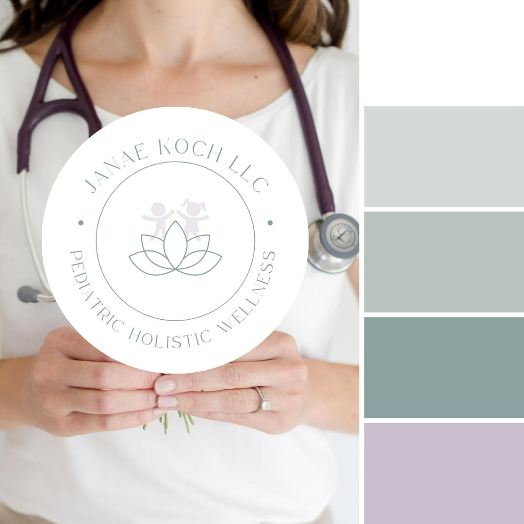
Original Mock logo & color pallet concept 1
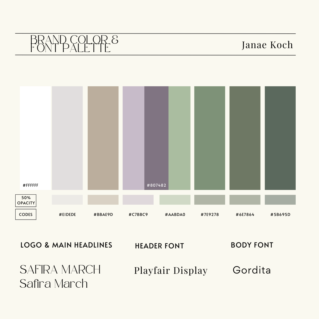


The darkest green does indeed work for a primary font color. Otherwise, charcoal hex #36454F would be a suggestion for the website main font if you’d like to stay away from pure black #000000.
BRAND DESIGNER NOTES
You’ll see that I added in a deeper purple.
For fonts, Gordita is a suggestion for the body font but any sans font will work beautifully. Will be sending over all high res. png & svg files upon final approval.
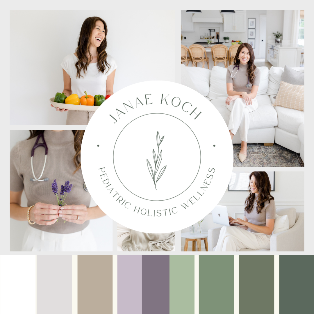
Merging the mock brand color pallet with the brand mood board and brand imaging showcases how cohesively they flow together and compliment one another which communicates brand integrity and coherency.
Client note: Pay attention to what emotion this mood board with color pallet evokes within yourself and ask, “Is this the emotion I desire for my target client audience?”
A well done logo builds trust and credibility. A winning brand evokes emotion. This is important to note because people take an action based on emotion as well as logic.
Original Mock logo & color pallet concept 2
Primary Logo on green w/ Submark & Icon


Primary Logo on white w/ Submark & Icon


Client Questions to Ponder
Overall Impression/ Specific Feedback on Logo
What was your first feeling/reaction when you saw the mock branding/logo options that you most like?
Does the design feel aligned with your brand’s mission, values, and target audience?
How do you feel about the overall shape, style, and layout of the logo?
(Identify any preferences or concerns related to the structure.)Does the logo represent the personality of your brand (e.g., approachable, professional, innovative)?
(Checks if the logo captures the brand's tone.)Are there any elements of the logo you love or dislike (symbol, font, icon, etc.)?
(Gathers detailed insights about specific design elements.)Do you feel the logo is versatile enough for different applications (website, social media, print, etc.)?
(Ensures functionality across various media.)
Color Palette Feedback
Do the colors resonate with the emotions or tone you want to convey (e.g., calm, energetic, luxurious)?
(Assesses if the color palette communicates the right message.)Are there any colors in the palette that you love or feel don’t work?
(Helps refine your color scheme.)Do you feel the contrast between the colors works well for readability and visibility?
(Checks practicality of the palette.)
Typography and Font Choices
How do you feel about the font(s) used in the branding/logo?
(Gathers feedback on typography.)Do you think the font style matches your brand’s voice (e.g., bold, classic, elegant)?
(Ensures typography reflects the brand’s character.)
Additional Elements
Do you feel the branding and logo designs will appeal to your target audience?
(Validates the relevance to your market.)Are there any elements or design choices that feel off-brand to you? If so, what would you change?
(Encourages suggestions for improvement.)How do you envision this design being used in your marketing materials or digital presence?
(Assesses how well the design fits into your practical applications.)
Next Steps
Is there anything else you'd like to see explored or adjusted in the next iteration?

Janae,
Please thoroughly review primary logo revision 1 and write a list of specific feedback regarding what you love, what you don’t like at all, and what you would like revised and refined. I expect to receive and perform multiple edits and reviews before we solidify a primary logo and color pallet before moving forward with the rest of the branding project which includes:
Primary logo
Secondary logo
Submark
Icon
Fonts (Primary & Secondary)
Color Pallet (hex codes included)
Brand guidelines
png & vector (svg) image files delivered
If you’d like to set a phone or zoom call to discuss these mock ups before moving forward, I am happy to do that.
- Rachel R.